Velox ThemesVelox Themes
BETA
Velox ThemesVelox ThemesBETA
Loading library
Loading component details
Multi Select Dropdown with Checkbox | Velox Themes
  1. Components
  2. /
  3. Liquid Multi-Select Dropdown
Locked

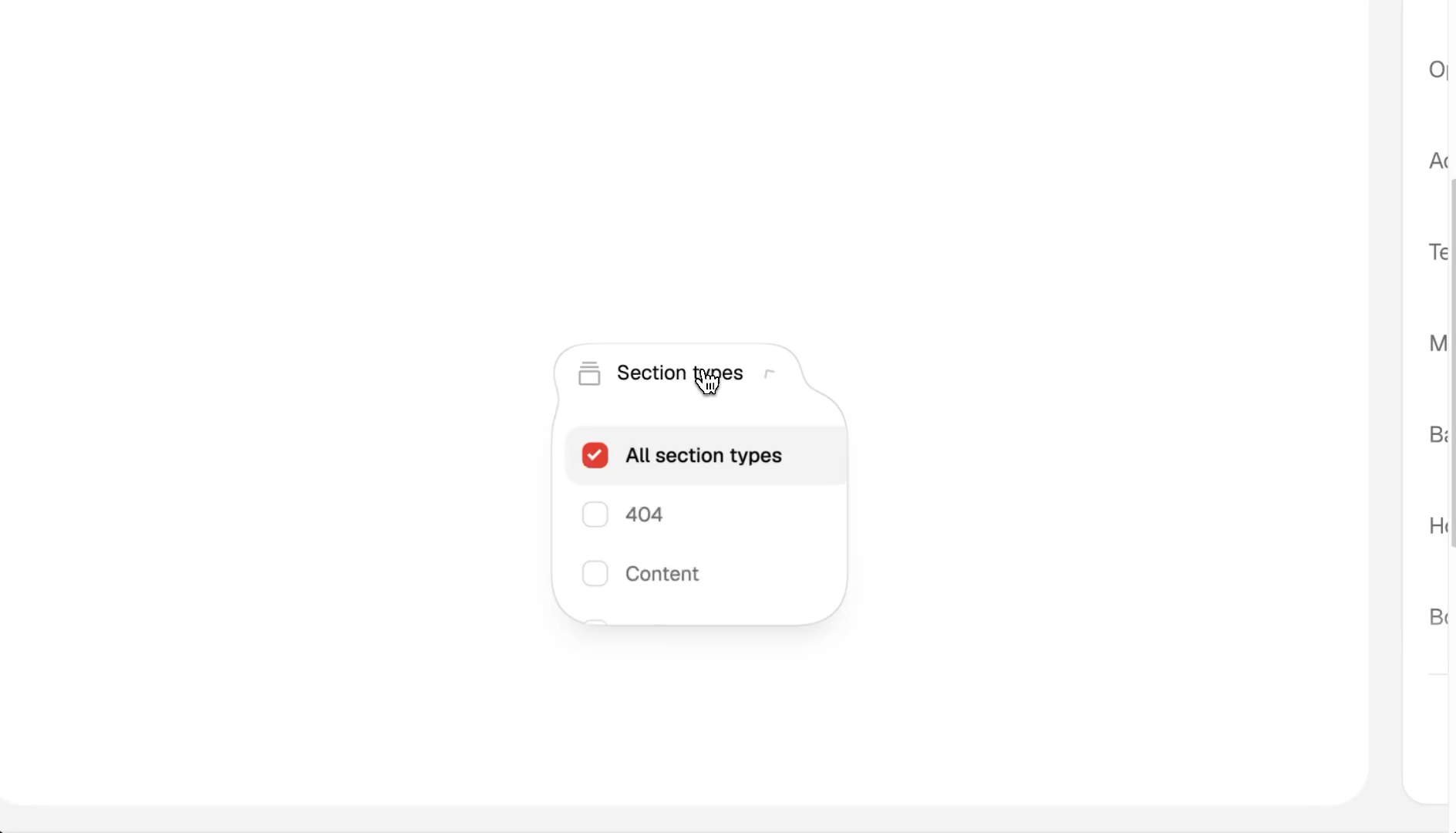
Liquid Multi-Select Dropdown

Liquid Multi-Select Dropdown preview

Recorded preview. Sign in with eligible access to unlock the interactive preview.

Menu

Menu font
Options

Layout

Colors

Accent
Text
Muted text
Background
Hover
Border

Make it yours

Subscribe to customize this component.

About

Let visitors choose several options from one dropdown. The menu includes checkbox selection and animated opening.

Customizable options

PropertyWhat it changes
Menu font
Font family of the trigger and menu. The default Geist is a bundled face; any other Google font is loaded.
Weight
Font weight, in steps of 100.
Size
Font size of the trigger and menu.
Letter
Letter spacing of the trigger and menu.
Menu label
Text on the trigger pill. Must not be empty.
All option label
Label of the first option, which clears every other choice. Must not be empty.
Dropdown options
The checkbox choices, 1 to 20, in order. Each has a label (1–80 characters), a unique value (letters, digits, - or _, up to 40, never "all") and whether it starts selected.
Menu width
Width of the open menu (never wider than the viewport minus 16px).
Radius
Corner radius of the open menu.
Type
How the menu opens: no animation, an eased curve, or the liquid spring.
Ease
Cubic-bezier curve [x1, y1, x2, y2] (x 0–1, y −2 to 2), used only when the type is ease.
Time
Open duration; the chevron and the close scale with it.
Bounce
Spring bounce, used only when the type is spring.
Delay
Delay before every open and close animation.
Accent
Color of the checked checkboxes.
Text
Main text color.
Muted text
Secondary text color.
Background
Background of the trigger and menu surface.
Hover
Color of the highlight that slides to the hovered or focused row.
Border
Border color.

When to use it

  • Filtering a gallery, blog, portfolio or catalogue by several categories at once.
  • A light page that wants a small, polished interactive detail.
  • Up to 20 short options.

Avoid it when

  • Single-choice selection or form fields that must submit with a form: it is a checkbox filter.
  • Long option lists or long labels: the menu is 180–400px wide and options are capped at 20.
  • Inside an ancestor with transform, filter or contain paint: the fixed menu would be offset.

Keep when you customize

  • The liquid morph, the sliding highlight and the All option behavior.
  • Keyboard support and the live region that announces the selection.
  • More components

    See AllSee AllSee All
    Number Counter preview
    Free
    Number Counter
    Glow Button preview
    Locked
    Glow Button
    Book a Call Button preview
    Free
    Book a Call Button