Recorded preview. Sign in with eligible access to unlock the interactive preview.
About
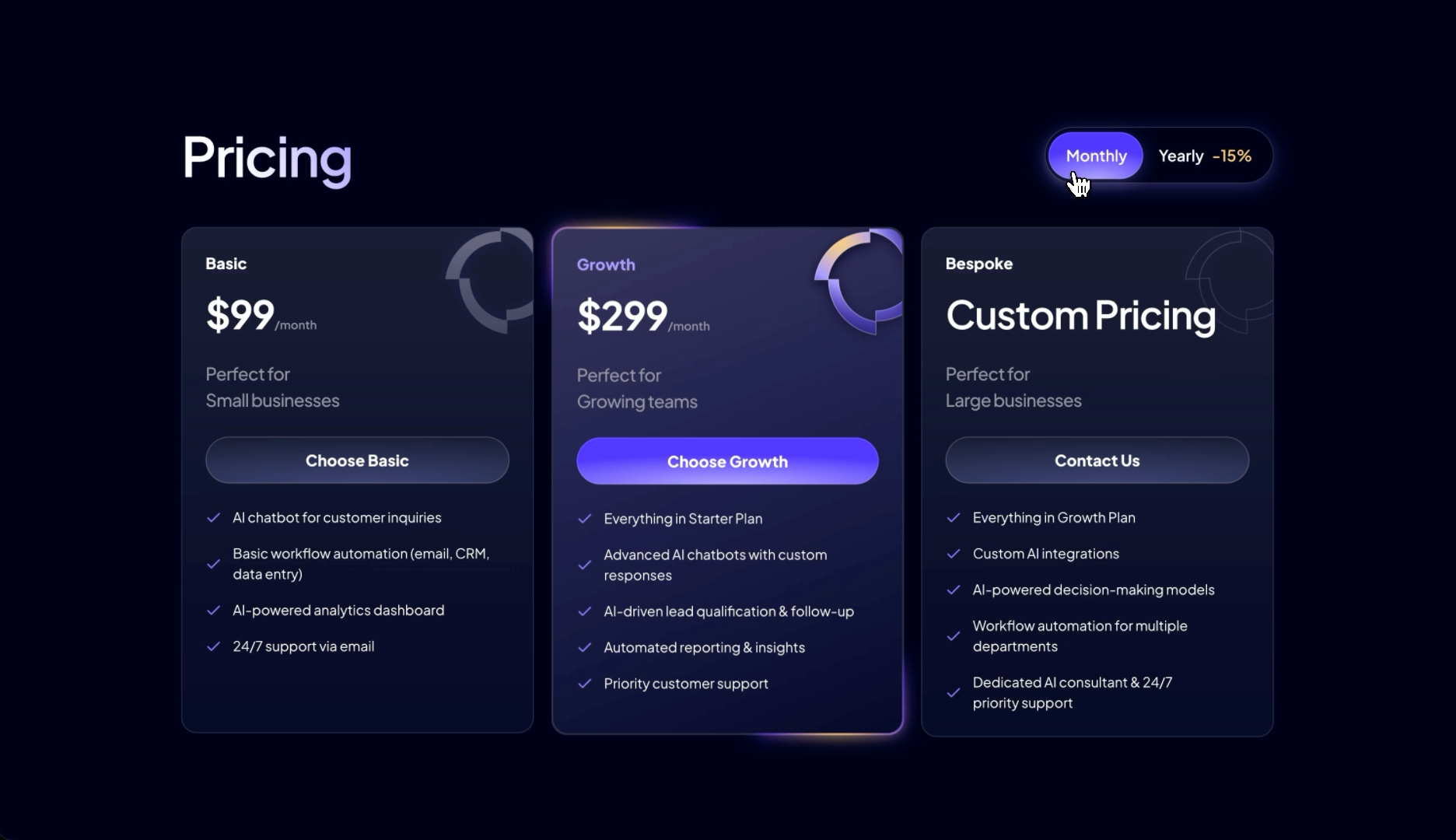
This is a dark pricing cards design with three plans: Basic, Growth and a custom plan. A switch lets people see monthly or yearly prices. Each card lists what the plan includes. It comes from Bima, a website template for AI agencies.
Get the code for React, Next.js or HTML, or copy it to Framer.
When to use it
Three tiers: an entry plan, a recommended middle plan and a custom or contact-based top plan.
Monthly and yearly billing, with a yearly discount badge.
A dark Bima-style page, after the proof sections.
Avoid it when
One, two or more than three plans: each card has its own entrance direction and place in every breakpoint layout.
Long feature lists: each card is built for at most five checked rows.
A single billing period: the switch is part of the heading row.
Light pages: the ring glows and violet hovers are tuned for midnight navy.
What you can change
Heading
Pricing
Period switch
Monthly / Yearly, with a -15% badge on Yearly
Plans
Basic (Perfect for Small businesses, Choose Basic); Growth (Perfect for Growing teams, Choose Growth, highlighted); Bespoke (Perfect for Large businesses, Contact Us)Basic and Growth show a per-month price that changes with the switch; Bespoke shows Custom Pricing.
Feature rows
Four rows on Basic, five on Growth and Bespoke, each with a check iconGrowth starts with Everything in Starter Plan, Bespoke with Everything in Growth Plan.
Price suffix
/month
Ring images
Three glowing ring images (PNG), one per card, from cdn.veloxthemes.comDecorative, with empty alt text.
Keep when you customize
The rolling digits, the sliding switch pill and the matching ring glow change.
The middle card's looping border glow and the button glow on hover.
The switch's button semantics (pointer, Enter and Space) and the price's spoken label.




 Part ofKurawa